Dirty Warrny
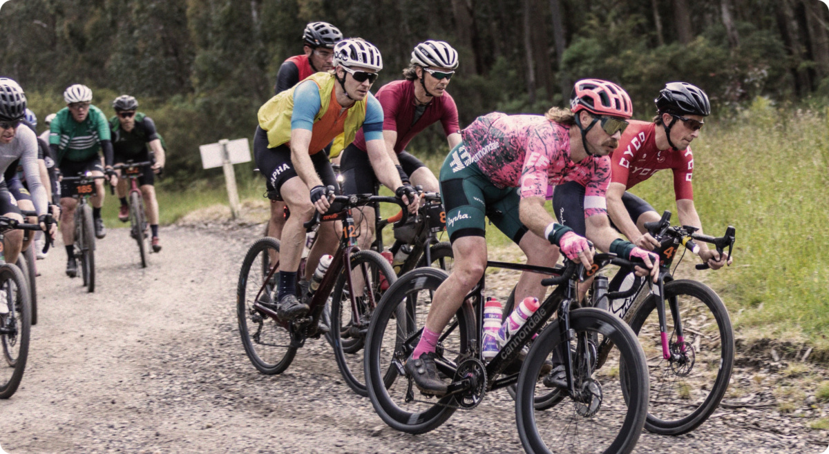
Heralded as the Southern Hemisphere’s largest gravel cycle race–Dirty Warrny, now in its 3rd year–stands as a testament to endurance, skill and sheer passion for the road less travelled. The main race consists of a breathtaking 246 kilometres of gravel and road through the Otway forest.

Approach
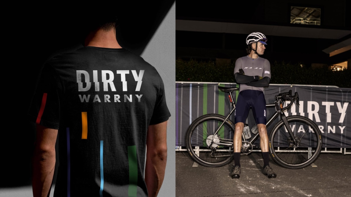
The brand identity captures the thrill of cycling on gravel, with the jagged typography of the wordmark evoking the skid of gravel beneath your wheels and the traction of rubber on a dirt road.
The course challenges riders with demanding terrain—steep climbs and descents, cool forests, distant waters, townships, and cities. Drawing from elevation data from the race, we created a colour palette that mirrors the environment, transitioning from the greens of the forest to the blues of Geelong. As the elevation increases, so does the pain and strain of the ride. A bold red colour intensifies this sense of pressure and energy, reflecting the physical challenge faced by riders.


Completed at Caramel Creative with:
Aaron Lee, Beck Maher, Josh Clough
and Oliver Chaffe