Hendry’s
With a heritage of cycling stores and cycling excellence across the Bellarine Coast and Greater Melbourne area, Hendry’s enters a new chapter.
Challenge
Since 1975, Hendry’s has been the trusted name in cycling. Founded by Ian Hendry, the business is now entering a new era under the ownership of Simon Gerrans, an Australian Tour de France and Giro d’Italia stage winner, and an all-round Aussie cycling legend.
A refreshed brand strategy and expression were needed to differentiate Hendry’s within a crowded local market and to appeal to a shifting audience. The goal was to move the brand’s perception away from heavy discounts for families, to a brand that resonates with quality and affordability for both families and passionate cyclists, including avid riders and riding clubs.

Approach
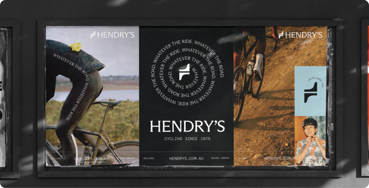
Expressing our brand idea “Whatever the road, whatever the ride,” the visual identity honours Hendry’s heritage while embracing a modern, contemporary style.
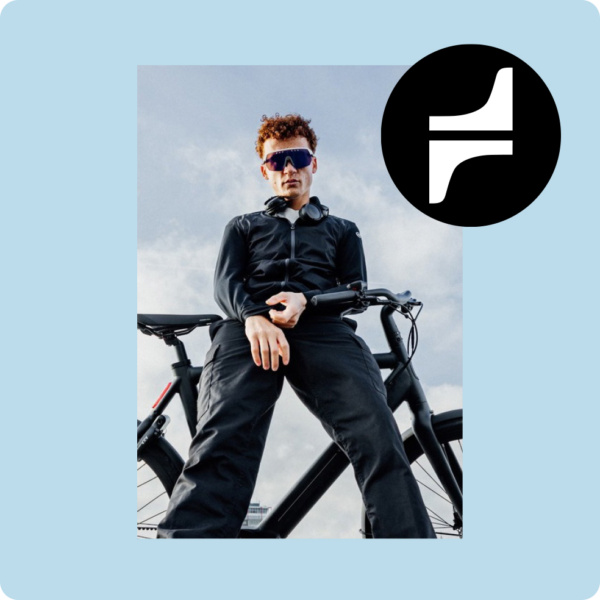
The logo draws inspiration from traditional bike badges once seen on the head tube, combining the ‘H’ of Hendry’s with the coastal shape of the Bellarine Peninsula.
While kids and families remain a core part of Hendry’s customer base, the brand has evolved to be more expressive and playful. Illustrations of customers and their unique cycling experiences bring a lively, engaging, and distinctive look to Hendry’s, capturing the essence of both adventure and community.
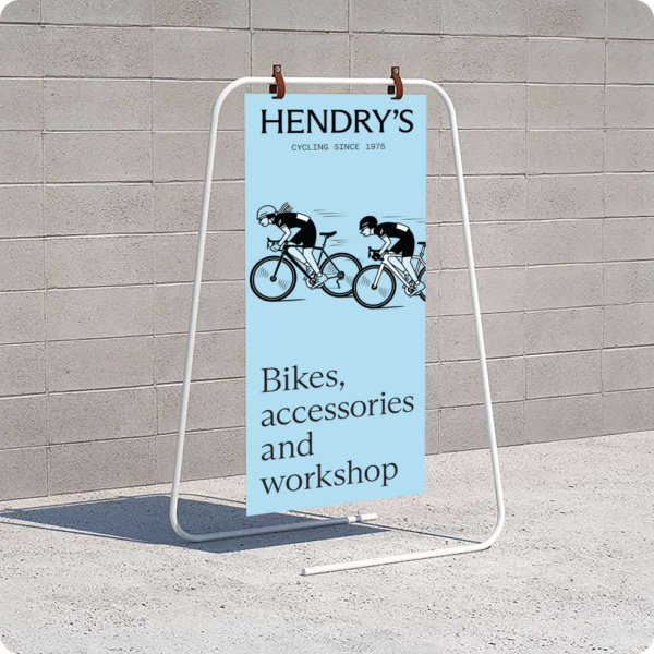
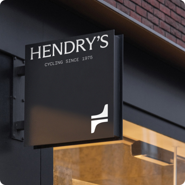
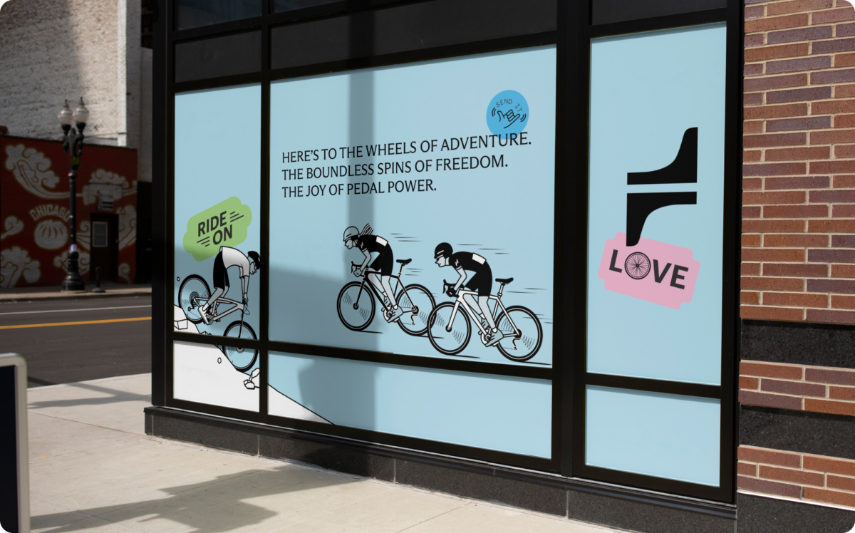
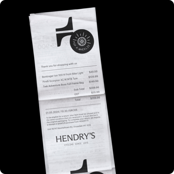
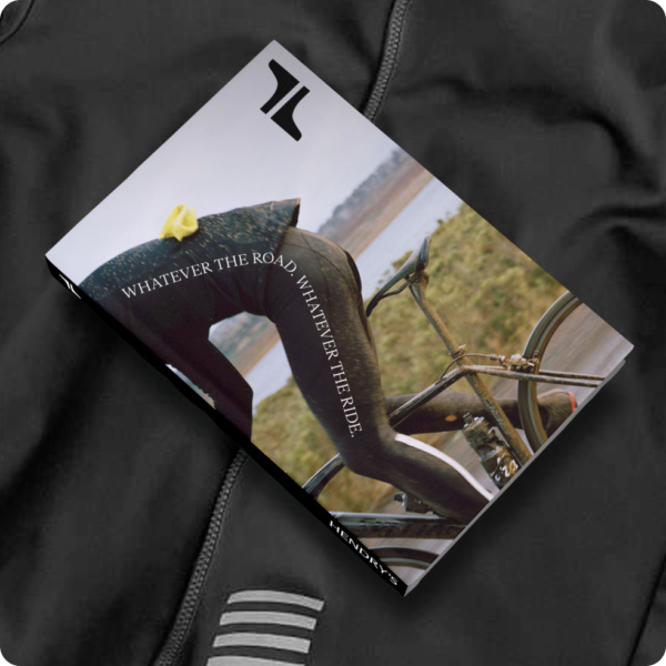
We redesigned and updated all Hendry’s on/offline touchpoints; across external and internal stores, business tools, merchandise, social and digital communications.
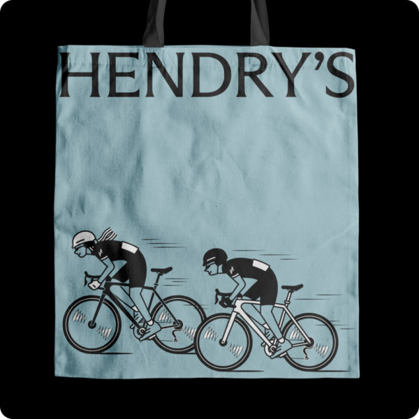
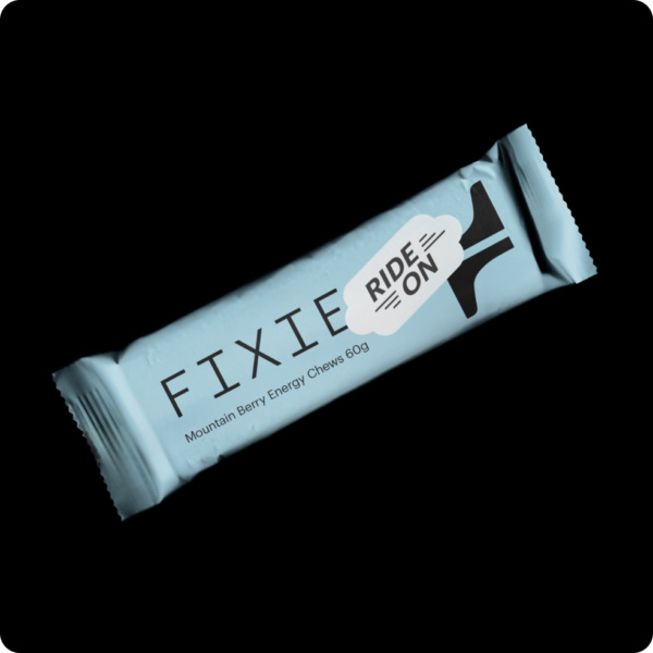
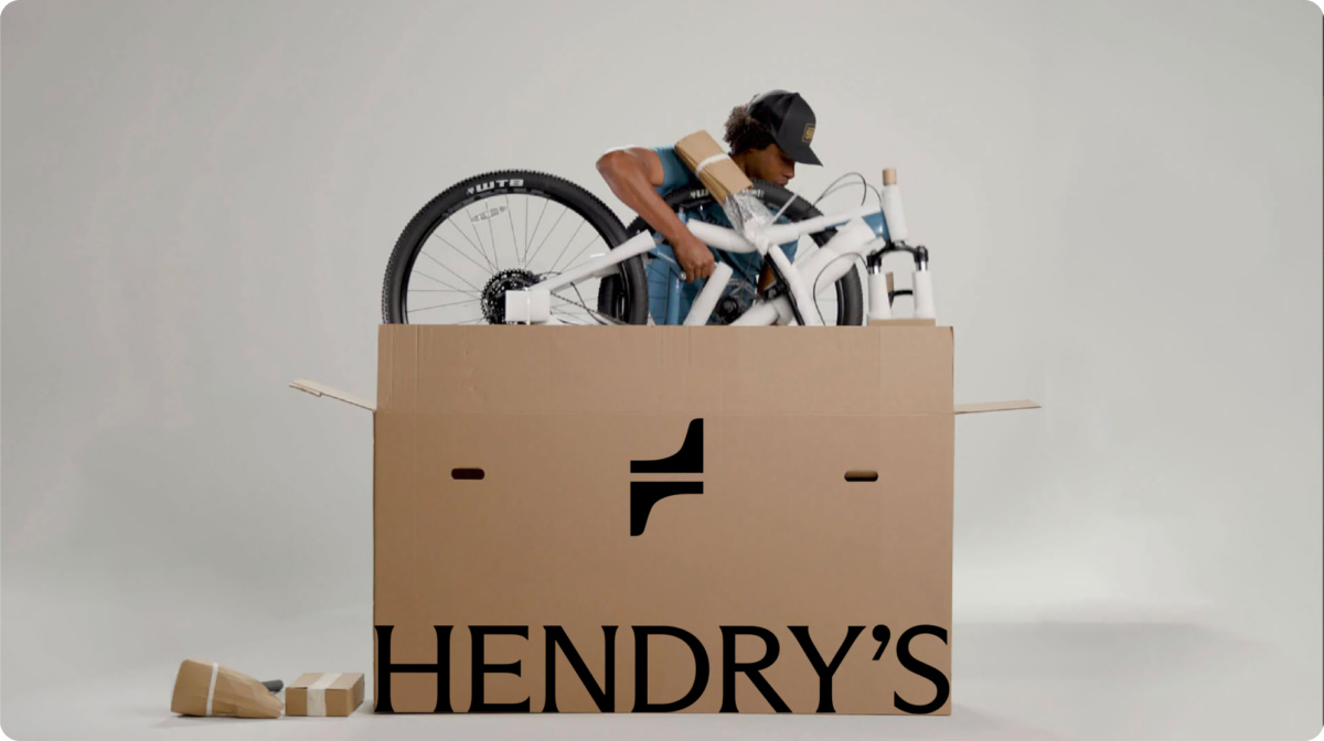
With kids and families a core part of Hendry’s customer base, the brand stretched to become more expressive and playful. Illustrations of customers and their bike lives creates an engaging and distinctive Henry’s look.
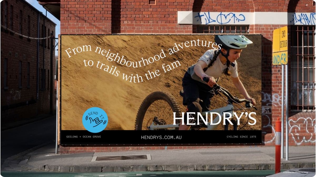


Completed at Caramel Creative with:
Aaron Lee, Carolyn White, Josh Clough
and Oliver Chaffe
Illustration: Nikko de Jesus