Speck
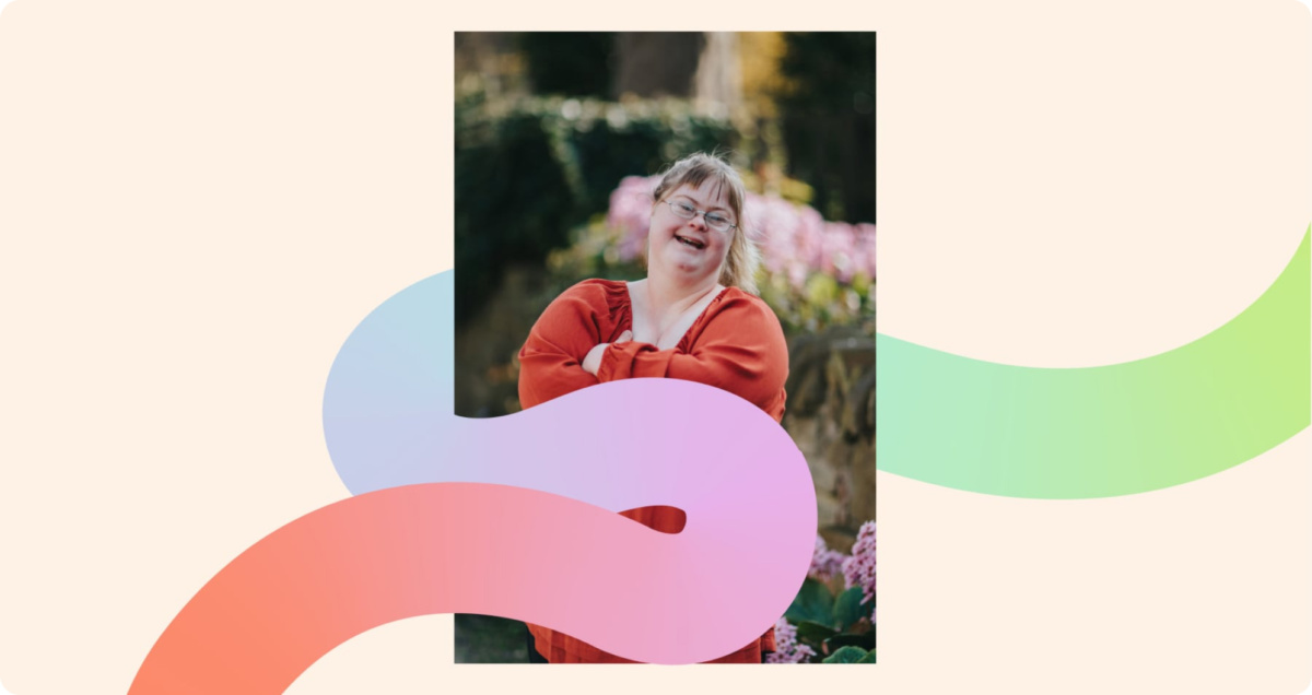
Helping NDIS participants live their fullest lives and reach their true potential.
Speck is a Specialist Disability Accommodation (SDA) provider dedicated to finding and providing, design-led homes that significantly improve the lives of people with disabilities. With a focus on creating living spaces that are personal, safe, connected and right, Speck ensures that each home meets the unique needs of its residents.
Working with the Speck team across collaborative sessions, we identified the brand idea: “Realise Your True Potential.” This idea reflects the journey to find the right Speck home that helps tenants live their fullest lives and reach their true potential.

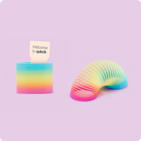
The visual identity uses an expressive rainbow-coloured graphic line to project a feeling of moving forward while capturing the honesty of life’s ups and downs.
The gentle nature of the Speck graphic symbolises the support and comfort tenants experience with Speck. Employing colour and energy pushes the brand away from the usual sector tropes, creating a distinctly fresh brand.
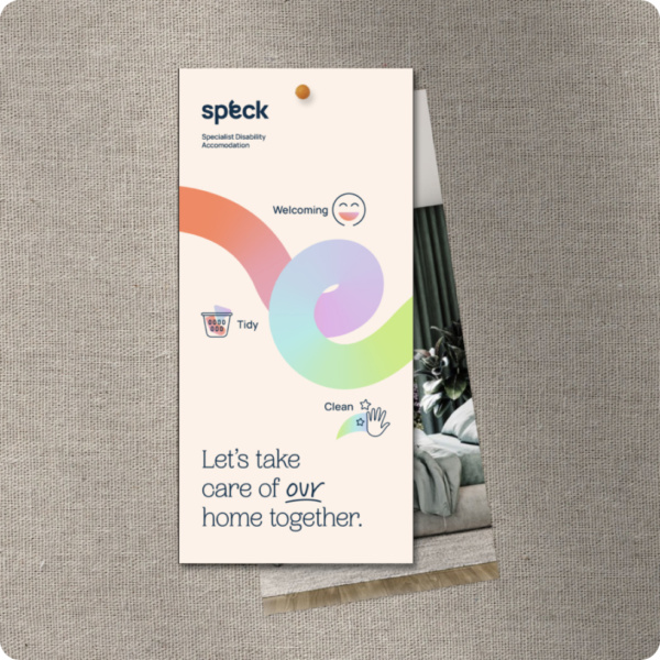
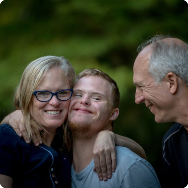
A considered selection of imagery, colours and the icon suite draw connections to nature while evoking a sense of calm and compassion. A key colour we incorporated within the spectrum was purple, globally recognised as symbolising a new positive narrative for disability.
Completed at Caramel Creative with:
Aaron Lee, Oliver Chaffe, Christian Lux,
Emma Jennings, Josh Clough