Tafe Gippsland
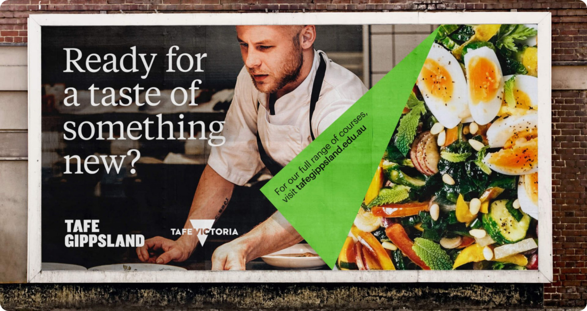
‘Federation Training Tafe’ had lost its identity and its connection with local communities, industries and people. Gippsland wanted its Tafe back – a stronger, better and bolder Tafe.
Challenge
Several years ago a number of Gippsland TAFE campuses merged to form Federation Training. This merger served its purpose at the time, but there was a sense that TAFE in the region had lost its connection with the community and its purpose as a brand. The organisation needed a new name and brand to show students, community and businesses that this is their local TAFE, and it is bigger, bolder and stronger than ever.
Approach
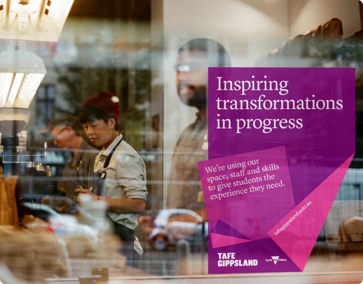
Through a series of in-depth interviews, workshops, and research with students, industry leaders, government, schools, and the broader community, we crafted a brand strategy highlighting TAFE’s passionate mission: ‘To change people’s lives through education.’
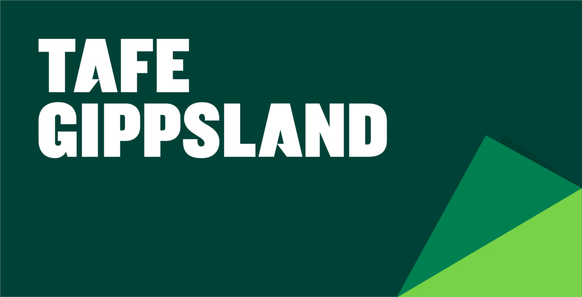
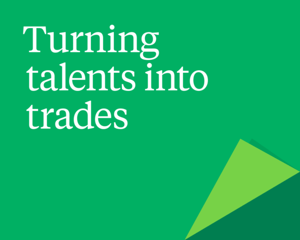
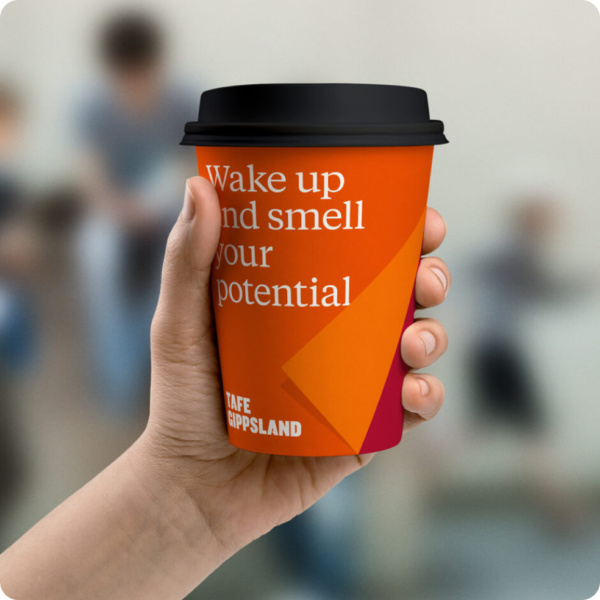
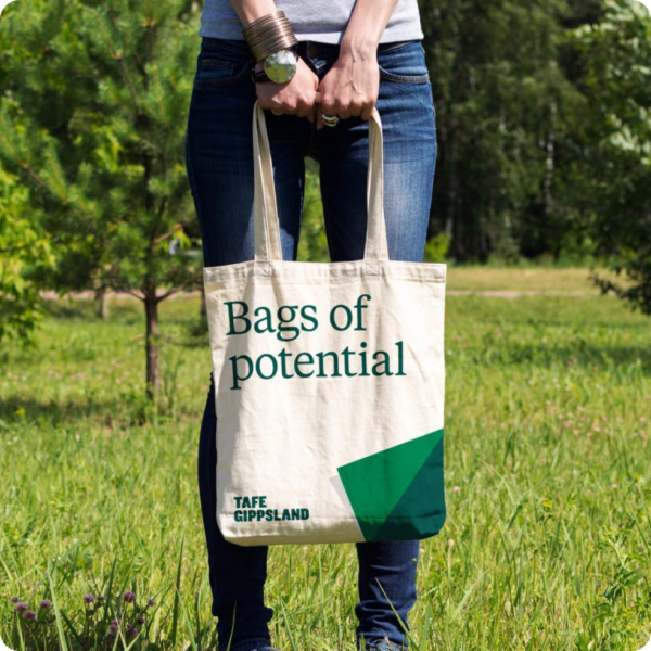
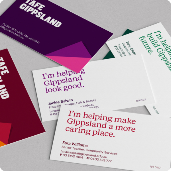
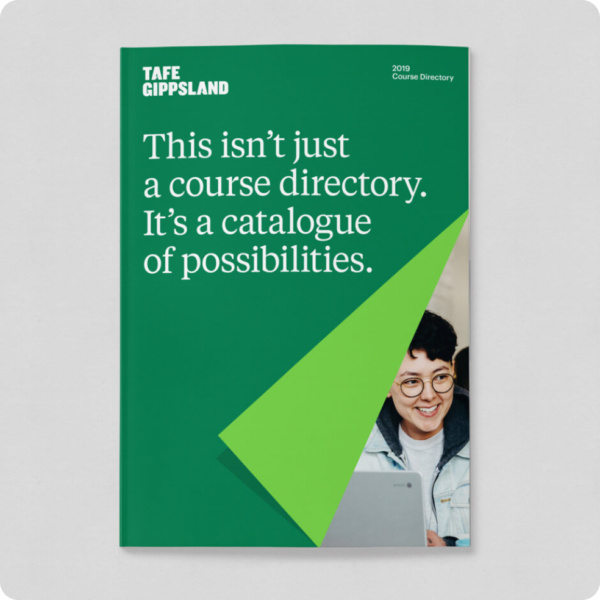
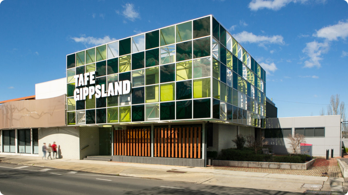
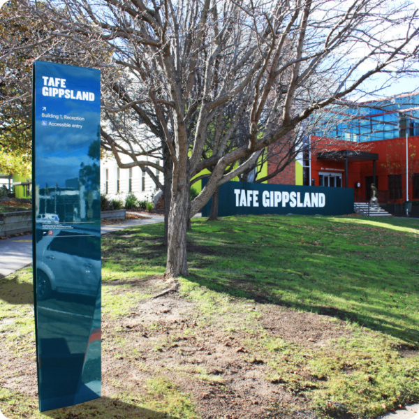
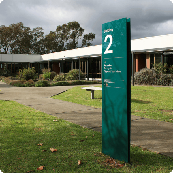
This dedication to transformation forms the foundation of a bold and confident new identity, marking a fresh chapter for the organisation. Drawing inspiration from the greens of the Gippsland landscape, the identity features optimistic language and confident typography and graphics that talk to the strength and ambition of the local region.
Completed at Milo & Co with:
Rachel Miles, Gary Townsend, Jo Bane and Cera O’Grady